
Insurance · Fintech · Latin America
Insurance · Fintech · Latin America
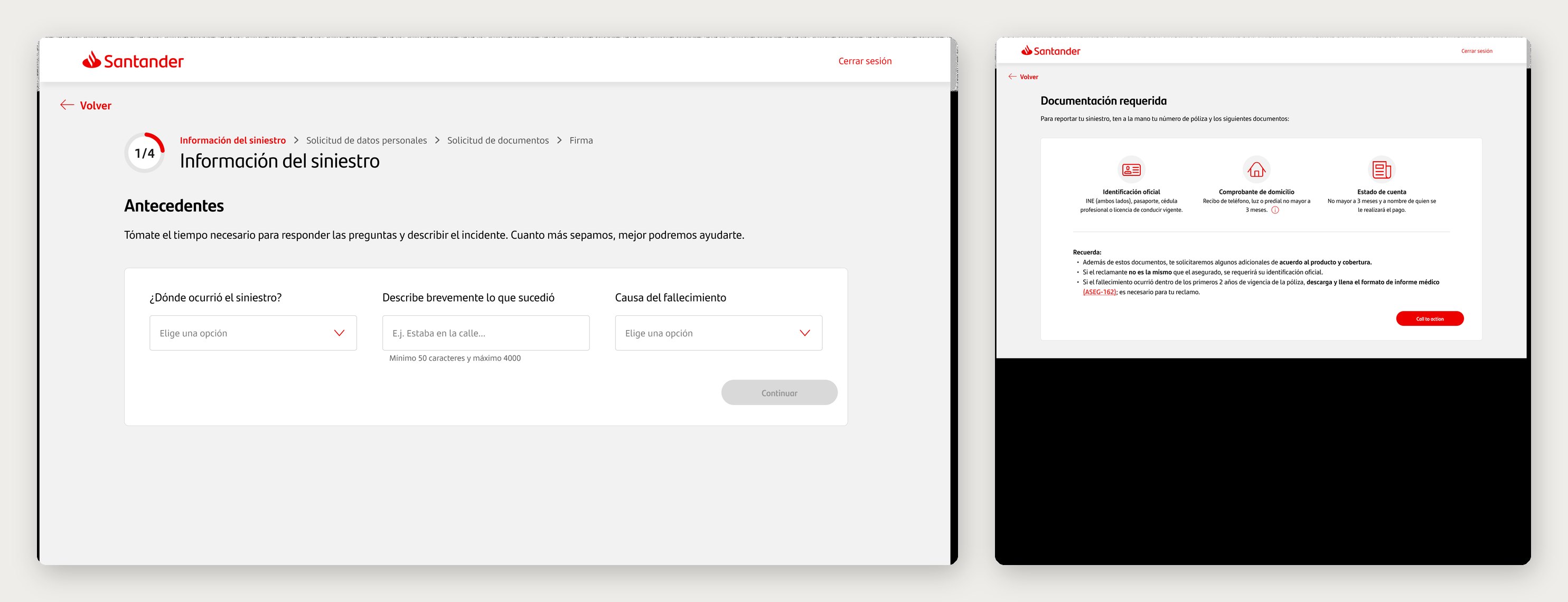
Outcome
A claims platform that forced people onto a computer, never told them which documents they'd need, and lost their progress the moment one was missing — rebuilt into a guided flow they could finish on a phone, in four steps.
The fix wasn't a nicer form. It was removing the three reasons people got stuck — no saved progress, no upfront requirements, and no way to do it from a phone.
01 · Context
Zurich Santander is one of the largest bancassurance alliances in Latin America — over 1.5 million customers across Mexico, Argentina, Brazil, Chile, and Uruguay.
The platform had three structural problems that turned a stressful moment into an ordeal. There was no login, so if someone started a claim and was missing a document, there was no way to save their progress — they had to find it and begin the entire process again. There was no responsive version, so filing a claim forced the person onto a computer, often impossible in the middle of an emergency. And nothing told them which documents they'd need until they were already deep in the flow — exactly where they got stuck. The result was abandoned claims and expensive support calls, at the worst possible moment for the person.
The scope was the claims journey end to end — the customer-facing reporting flow and the internal claims-management system that staff use to resolve them.
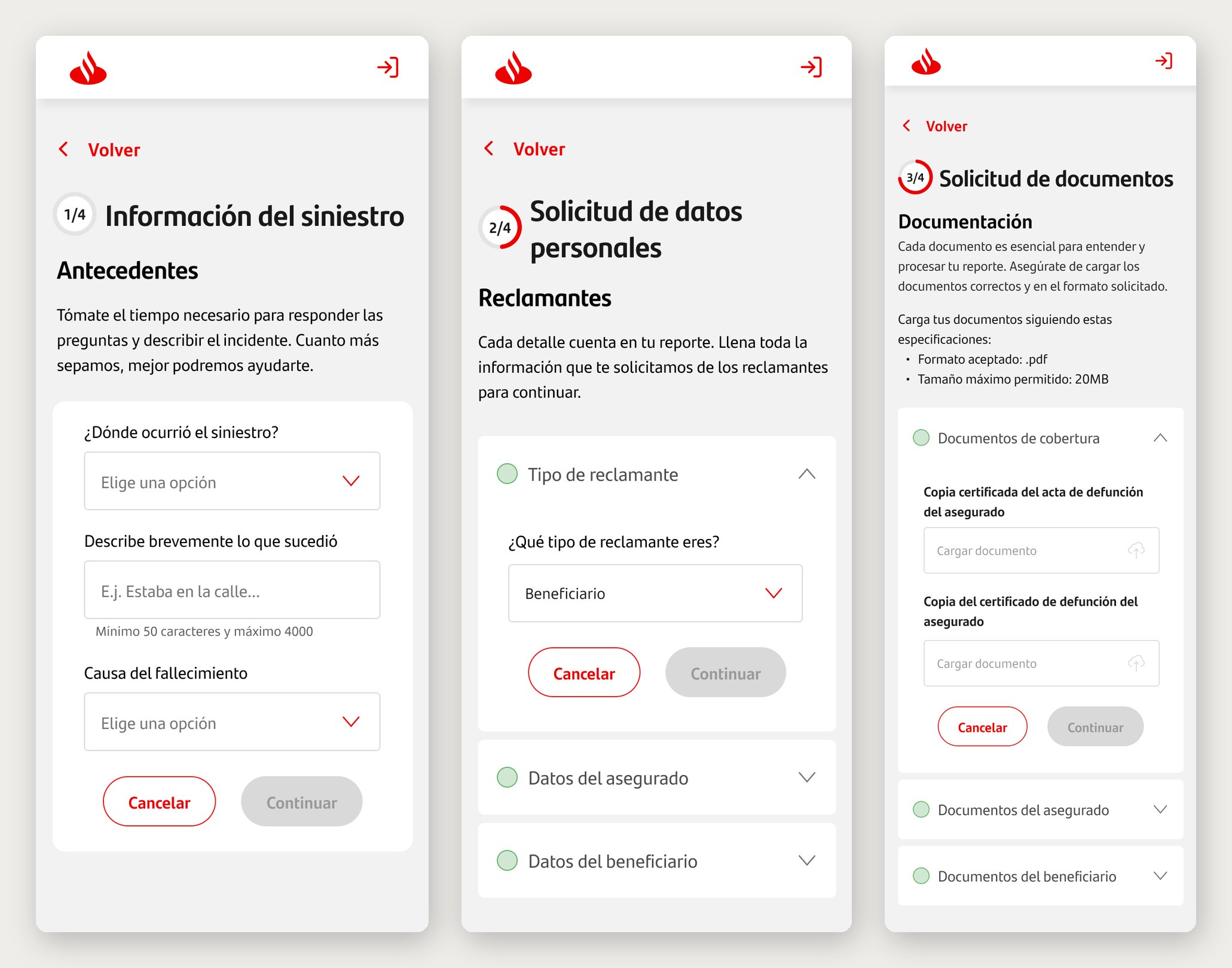
Mobile — the four-step flow: incident, personal data, documents, signature.
02 · Process
I led the UX strategy and service design across the three platforms, partnering with product, engineering, and operations. My job wasn't to make the screens nicer — it was to find where, and why, people were failing, and decide what to change.
Discovery: user interviews, contextual inquiry, and a read of support-call transcripts. The pattern was consistent — people weren't failing at the end, they were failing at the start: no idea which documents to bring, no way to save progress, and no option to do it from a phone. user interviews, contextual inquiry, and a read of support-call transcripts to map the real friction. We expected the fix to be comprehension — clearer forms. The transcripts pointed somewhere more expensive: people called because nothing told them their claim had gone through, or what came next. Silence after submission drove more calls than any single confusing field.
Definition: mapped the full service blueprint — front stage and backstage — and traced the drop-offs to three root causes: no saved progress, no upfront requirements, and desktop-only access. Mapped the full service blueprint — front stage (user experience) and backstage (operations) — to understand the systemic causes. Prioritized three critical failure points: form comprehension, document requirements clarity, and post-submission anxiety.
The decisions that mattered: a login to save progress, so a missing document meant pausing, not starting over. Requirements and timing up front — the moment someone chose the type of claim, the platform stated exactly which documents they'd need and how long resolution would take, before they began. A guided, step-by-step flow that collapsed 20+ steps into 4. And responsive from the start, so a claim could be filed from a phone, not only a computer. a guided path over a smarter form — a better form is still a form, and someone mid-crisis needs a path, not fields. Document requirements surfaced before the user starts, even at the cost of a heavier first screen — the lighter “start now, ask later” pattern only sent people away to hunt for papers mid-flow. And post-submission status treated as a first-class feature, not a confirmation screen — the cheapest thing to skip, and the exact reason people kept calling.
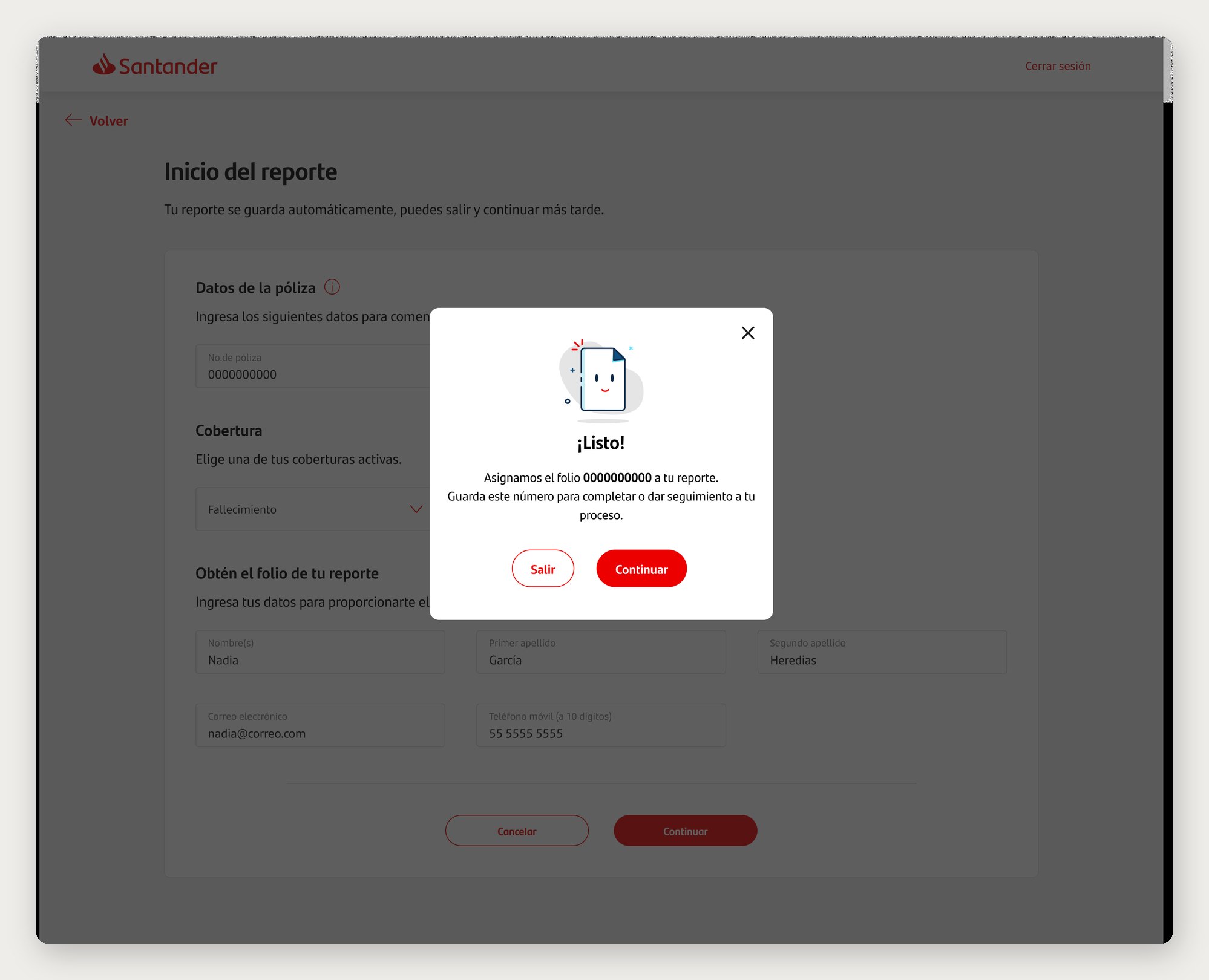
Web — the same flow, with progress saved to the account and a folio to track it.
03 · Claims Flow
The flow was rebuilt around four clear steps — Incident → Personal data → Documents → Signature — each showing only what's relevant at that moment. The 20+ disconnected steps of the old process were gone, and the same experience worked on web and mobile..
Before the first step, the platform showed exactly which documents were required for that claim type and the expected resolution time — so no one got surprised mid-flow. And because progress was saved to the account, a missing document meant coming back to where you left off, not starting over.
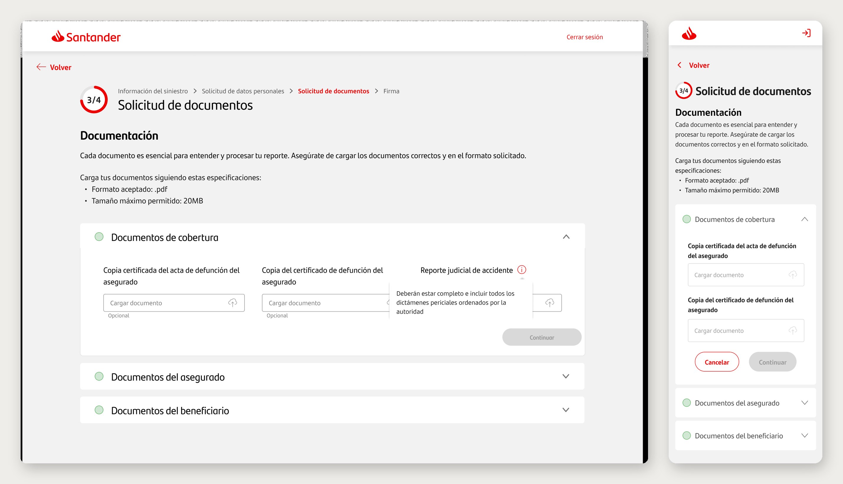
The same step on web and mobile — required documents made clear from the start.
04 · Results
People could now start on a phone, know upfront what they'd need, and pick up where they left off. The claim stopped being a reason to call support — and became something they could finish on their own.
Collapsing 20+ steps into 4, making requirements clear from the start, and saving progress across sessions were the biggest drivers behind the drop in support calls and abandonment.
05 · Lessons
Tell people what they'll need before they start. The change that prevented the most abandonment wasn't inside the flow — it was before it: stating the required documents and the resolution time up front, by claim type. Clarity at step zero beats polish at step ten. The change that moved support calls the most was the least glamorous one — telling people their claim existed and where it stood. I now treat feedback and status as day-one scope, not a polish item at the end.
Saved progress is a feature, not a convenience. If a process can lose someone's work, it eventually will. Designing for interruption — a login that holds progress across sessions — is what let people actually finish. The operational cost lives in the claims-management system the staff use, not only in the customer flow. Designing both with equal care is where the business case actually closes.
Responsive isn't optional in a moment of crisis. Assuming a computer excluded exactly the people who needed help most. Meeting them on the device they already had — a phone — mattered as much as any screen inside the flow. A single experience across five markets has to absorb regulatory and product variation by design, not by exception. Naming that model early would have saved rework later.