Fashion · Alta Costura · E-commerce · Mexico
Fashion · Alta Costura · E-commerce · Mexico
01 · Context
Paola Nájera is a Mexican fashion designer whose work celebrates Mexican identity, craftsmanship, and cultural pride through alta costura and contemporary ready-to-wear. Her brand needed a digital home that matched the sophistication and boldness of her collections — a website that could sell product while communicating a clear editorial and cultural vision.
My role covered the full web experience: concept and positioning, content architecture, UX design of all key pages, and image editing of the campaign photography to create the visual language used throughout the site.
02 · Content Architecture
One of the key strategic decisions was designing two distinct homepage experiences — one for new visitors discovering the brand (editorial/brand-first) and one for returning customers and buyers (e-commerce/product-first). This architecture serves both conversion and brand-building simultaneously.
| Page | Purpose | Key content |
|---|---|---|
| Home (E-commerce) | Drive product discovery & purchase | Hero carousel · Category grid · New Collection countdown · Featured products · Style guide CTA |
| Home (Brand) | Communicate identity & values | México 'Sta de Moda · Overshirt story · "Descubre tu estilo" · Prendas hechas con amor · Newsletter |
| México 'Sta de Moda | Flag product collection | Brand story · Editorial photography · Shop CTA |
| Tienda | Full product catalog | Category filters · Product cards with ratings · Wishlist · Quick add |
| Checkout | Convert cart to order | 3-step progress · Delivery options · Order summary · Aplazo/PayPal payment methods |
| Contacto | Connect with the designer | Contact form · Guadalajara location · Newsletter signup |
03 · Website Overview
The visual system uses a clean, fashion-editorial aesthetic — white space, bold typography, red as the only accent color — consistent with the Paola Nájera brand identity. Product photography was retouched and color-corrected to maintain consistency across all pages.
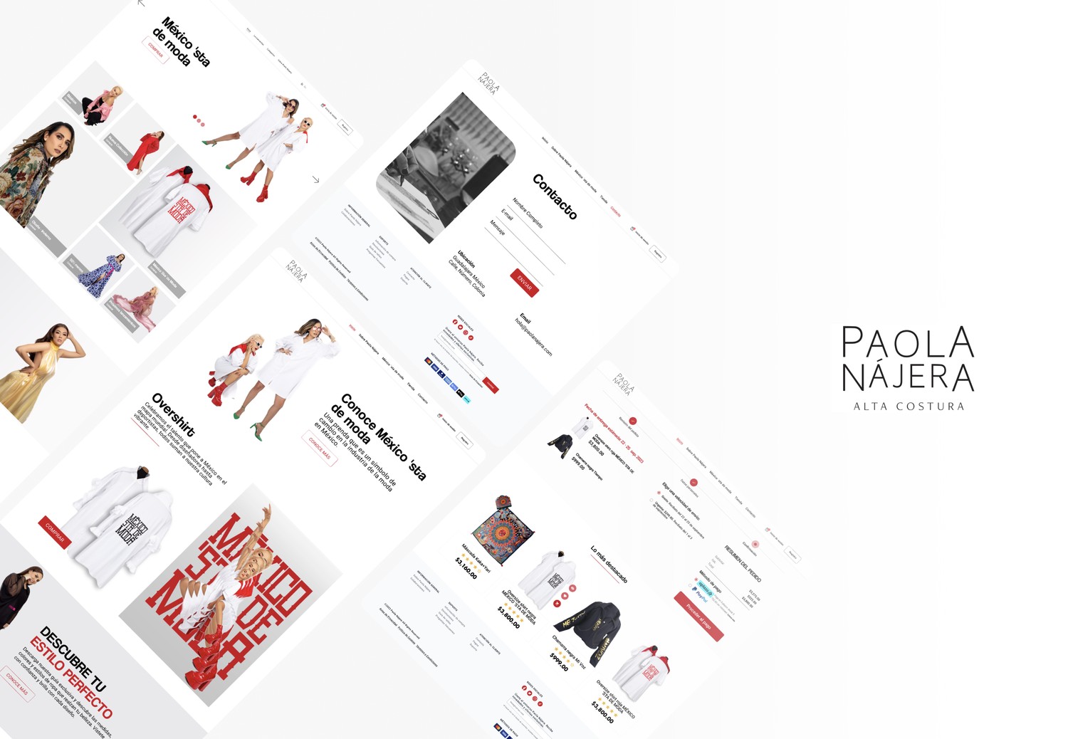
Full website overview — Homepage (e-commerce), brand homepage, contact, e-commerce store, checkout flow, and Paola Nájera brand mark
04 · Homepage Design
The e-commerce homepage (left) prioritizes product: a hero slider with direct "COMPRAR" CTA, a 5-tile category grid, a countdown timer for the new collection launch, featured products with ratings, and a newsletter CTA. Every element is optimized for conversion.
The brand homepage (right) prioritizes story: Mexico 'Sta de Moda as a cultural statement, the Overshirt as a vehicle for cultural pride, a style guide offer, and a curated "prendas hechas con amor" section. This version creates the emotional context that makes purchasing meaningful.
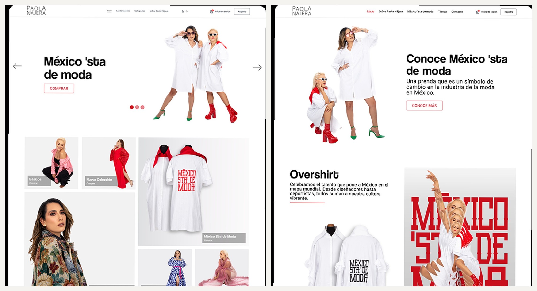
Left: E-commerce home — hero carousel, category grid, new collection countdown, featured products · Right: Brand home — México 'Sta de Moda story, editorial sections, style guide CTA
05 · E-commerce Flow
The checkout flow uses a clear 3-step progress indicator (Revisión del pedido → Datos personales → Confirmación), upfront delivery date communication, and a clean order summary with Aplazo (installments) and PayPal payment options — critical for a premium fashion brand where cart values are high and payment trust matters.
The contact page combines a minimal contact form with clear location and email information, maintaining the editorial aesthetic consistent with the rest of the site.
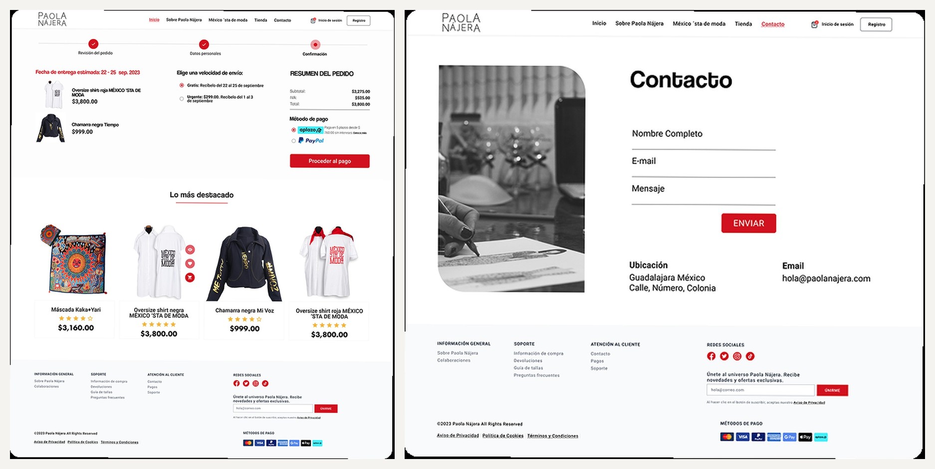
Checkout (3-step progress, delivery options, order summary, Aplazo/PayPal) · Contact (form, location, email, newsletter)
06 · Deliverables
This project required thinking simultaneously as a brand strategist (what story does Paola want to tell?), a UX designer (how does a customer move from discovery to purchase?), and an image editor (how do we make the product photography feel cohesive and premium?). The result is a complete digital brand expression for a designer whose work deserves a world-class stage.