UX/UI Design · Mobile App · Wellness · Mexico
UX/UI Design · Mobile App · Wellness · Mexico
01 · Project
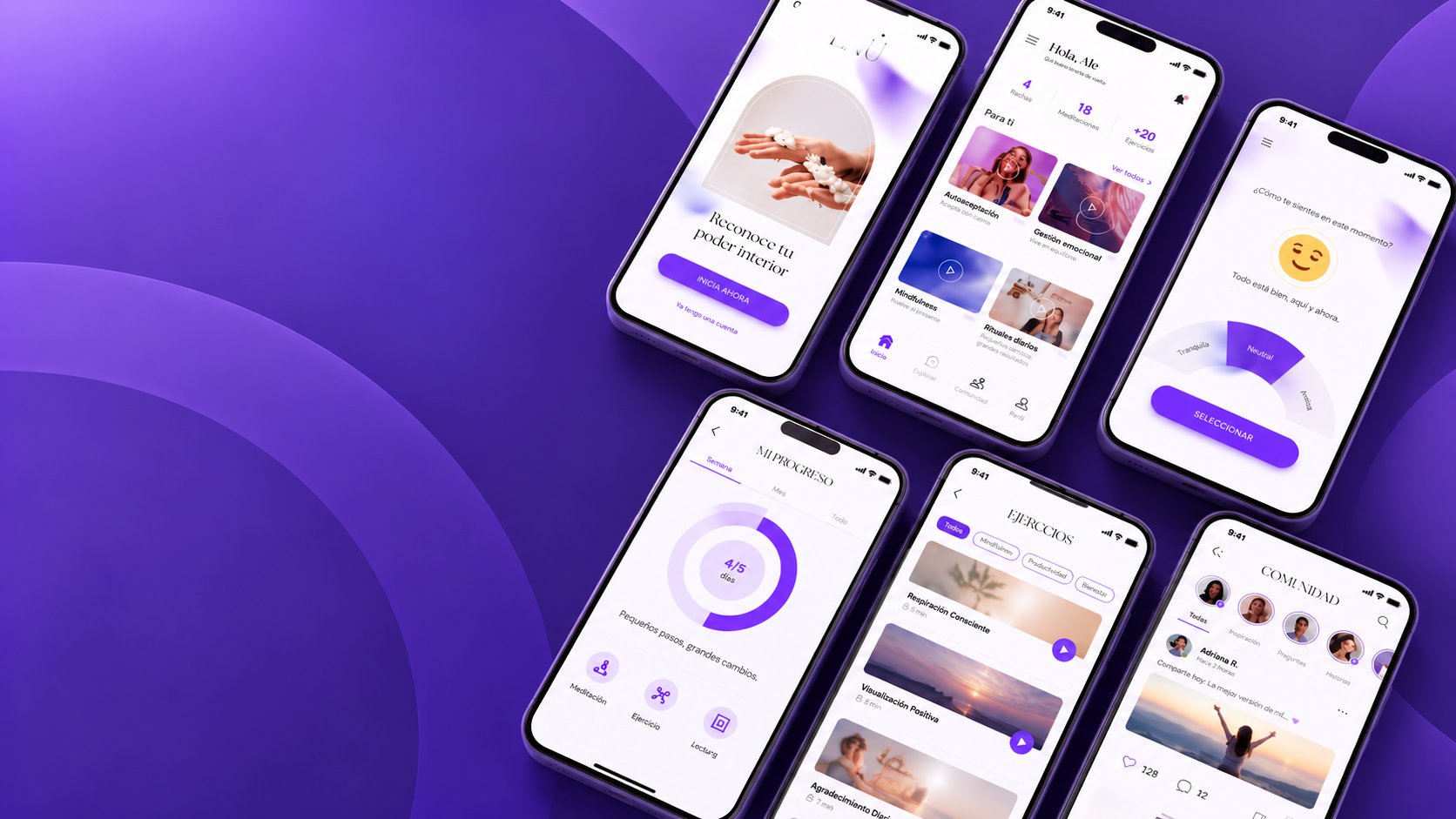
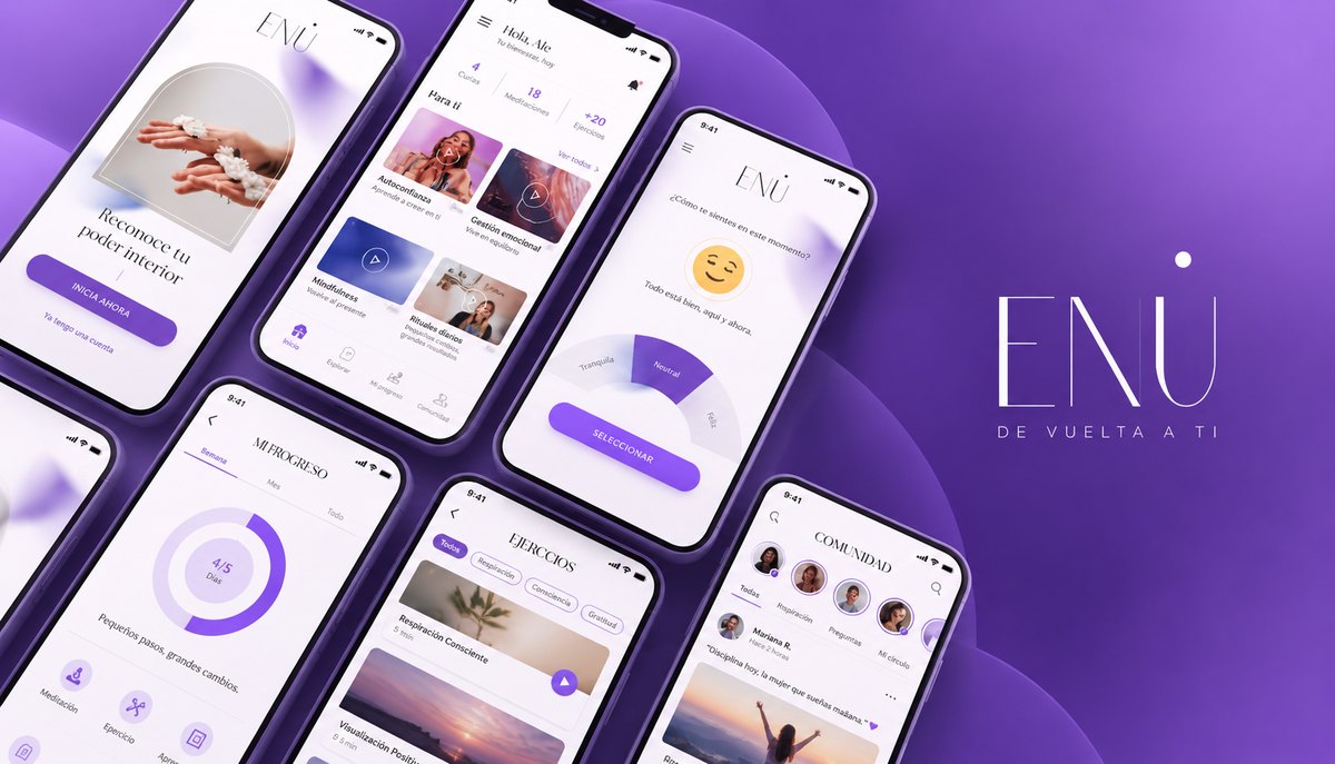
ENÚ is a women's empowerment platform offering coaching, courses, podcasts, meditation and breathing exercises, a community space, and live events — all in one app. The challenge: translate a rich, multi-format wellness ecosystem into a mobile experience that feels personal, not clinical, and empowering, not overwhelming.
My role covered the entire design process from zero — concept development, content architecture, user research, A/B testing, functional prototyping, and final UI design — creating an app that meets users where they are, whether they need a 5-minute breathing exercise or a full coaching program.
02 · Research & Strategy
The research phase focused on identifying the core emotional and practical tensions women face when approaching wellness apps: the gap between wanting to invest in themselves and the friction of apps that feel either too demanding (daily streaks, rigid programs) or too superficial (generic motivational content).
03 · Information Architecture
The navigation consolidates ENÚ's full ecosystem into four purposeful destinations — each with a single clear purpose that users could internalize in their first session. The architecture was deliberately flat: no deep nesting, no hidden content, no menus that required learning.
04 · Onboarding
The onboarding sequence was one of the most tested parts of the app. The goal: move a first-time user from zero to emotionally committed before they reach the home screen. Each of the three intro screens pairs an arched editorial photograph with a single affirmation — not a feature description, not a benefits list. A feeling.
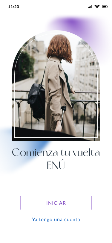
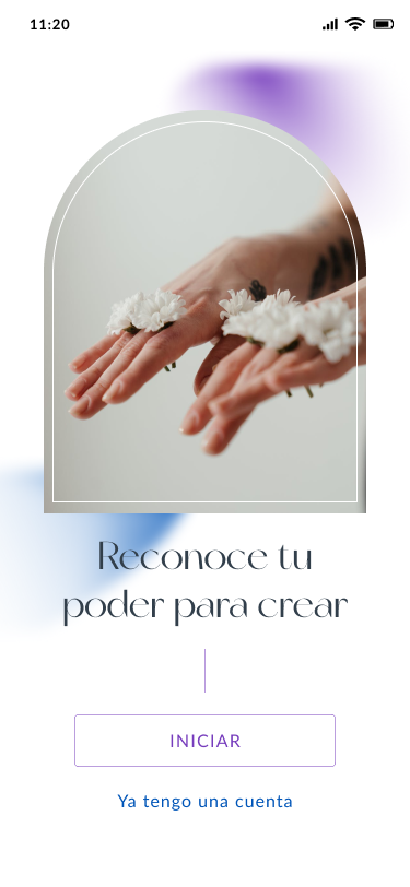
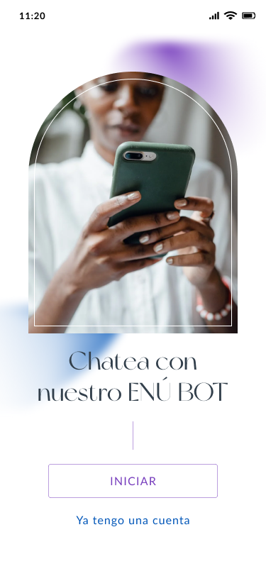
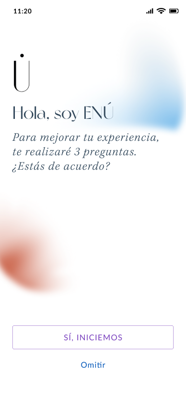
The A/B test on the onboarding tested two hypotheses: Version A led with the feature set (what ENÚ offers). Version B — the winner — led with affirmations and emotional language (who ENÚ is talking to). Version B showed a 34% higher completion rate and significantly lower drop-off before account creation.
05 · Core Screens
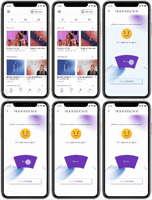
The Home screen is ENÚ's most complex surface — it aggregates content from five different content types (meditation, exercise, podcast, video, products) into a single personalized feed without feeling like a content dump. The mood check-in at the top ("¿Cómo estas?") gates the personalization loop, and the progress stats (Vueltas ENÚ, Días de Bienestar, Meditaciones) give users a tangible sense of accumulation rather than pressure to perform.
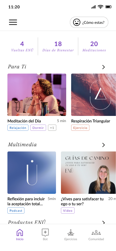 Home — feed personalizado
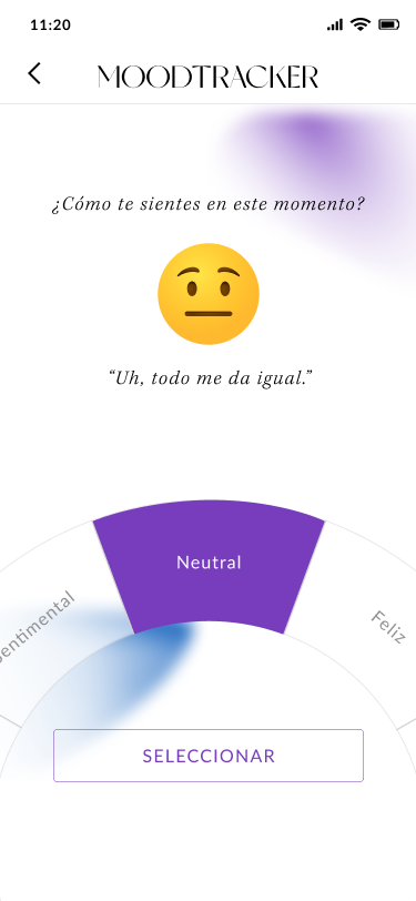 Mood Tracker — estado emocional
06 · Ejercicios
The exercises section needed to serve two very different user moments: someone scanning for the right exercise (list view) and someone in the middle of a session (guided experience). The list view uses outcome tags (Capacidad Torácica, Rendimiento, Ansiedad, Dormir) rather than exercise names as the primary filter — matching how users actually think about what they need, not what the exercise is called.
The in-session experience uses a minimal, full-bleed animated breathing circle — removing every UI element that isn't directly part of the exercise. The expanding and contracting rings guide the inhale/hold/exhale cycle visually without requiring the user to read instructions during the practice.
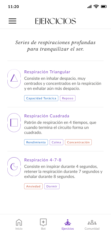 Ejercicios — lista por resultado
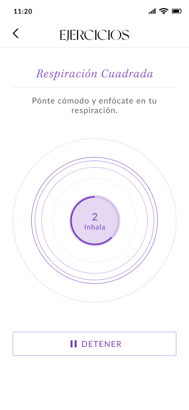 Sesión guiada — Respiración Cuadrada
07 · Comunidad & Bot
The Community screen was the most architecturally complex — combining stories, live events, and a social feed with topic tagging. The design challenge was to make it feel warm and personal rather than like a social media feed. The solution was visual hierarchy that leads with people (the story row at top) rather than content, and topic tags that work as emotional signals (Mindfulness, Metas, Meditación) rather than categories.
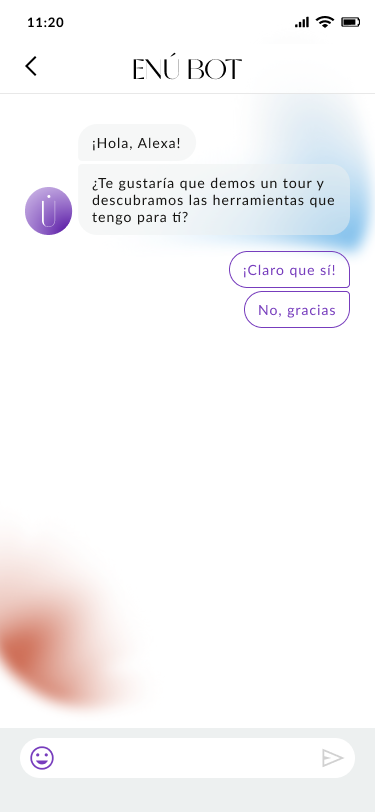
The ENÚ Bot follows a conversational UX pattern — natural language prompts, two-option responses, and a soft color language (purple for the bot, white bubbles for the user) that reinforces the feeling of a one-on-one conversation rather than a help menu.
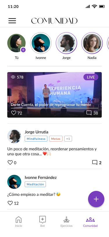 Comunidad — feed y eventos live
ENÚ Bot — interfaz conversacional
Comunidad — feed y eventos live
ENÚ Bot — interfaz conversacional
08 · Visual Design System
The ENÚ visual language is built on the tension between softness and intentionality — the same tension in ENÚ's brand message. A white base keeps the experience clean and non-anxious. Soft gradient blobs in purple and blue signal emotional states without imposing them. Typography pairs a serif display face (for warmth and editorial authority) with a light sans for body text. Purple is the sole accent — used strategically for actions, highlights, and the active state, never decoratively.
09 · Deliverables & Impact