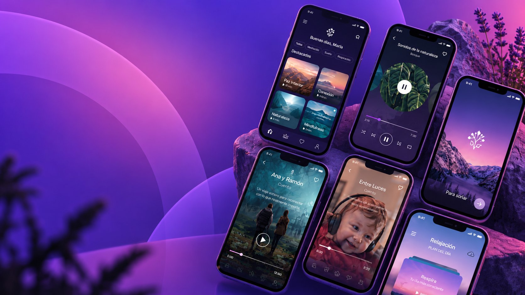
UX/UI Design · Mobile App · iOS · Android · Wearable · Mexico
UX/UI Design · Mobile App · iOS · Android · Wearable · Mexico
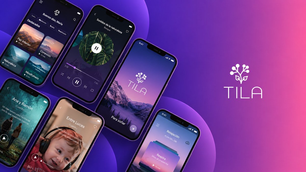
 TILA — App Principal
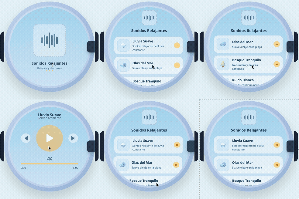 TILA Baby
01 · Project
TILA is a meditation and mindfulness platform offering guided meditations, sleep stories, relaxation music, breathing exercises, nature sounds, binaural audio, and structured wellness programs — available across iOS, Android, and Huawei Watch. The platform also includes TILA Baby, a dedicated experience for parents: bedtime stories, white noise, and lullabies designed specifically for infants and toddlers.
I led the full product design process from zero: concept, content architecture, multi-platform research, A/B testing, and end-to-end UI design across all three platforms — building a coherent system that works equally well for a 3-minute breathing session before a meeting and a 30-minute sleep program for a baby.
02 · Research & Strategy
The research phase mapped two distinct user profiles — adults seeking mindfulness and stress management, and parents looking for sleep support for their babies — and identified the key friction points that prevent meditation app adoption: complexity, guilt around consistency, and the mismatch between app expectations and real-life wellness moments.
03 · Information Architecture
Rather than organizing by content type (Meditations, Podcasts, Music), TILA's navigation is organized by emotional intent — the state the user is arriving in, not the format of the content. Each tab is a destination that answers a specific question the user is asking right now.
04 · Home Modes
TILA's home screen adapts visually to the context the user chooses: the main TILA experience, the sleep-focused Duerme mode, and the TILA Baby interface. Each has its own color temperature, content organization, and visual density — designed for the specific moment and lighting conditions users are in when they open that mode.
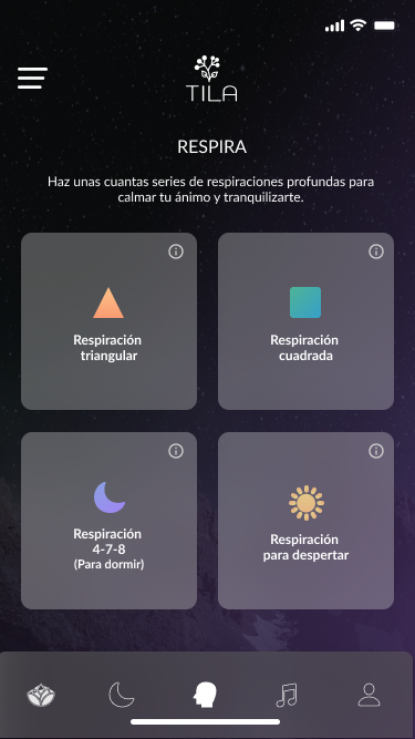 TILA · Respira
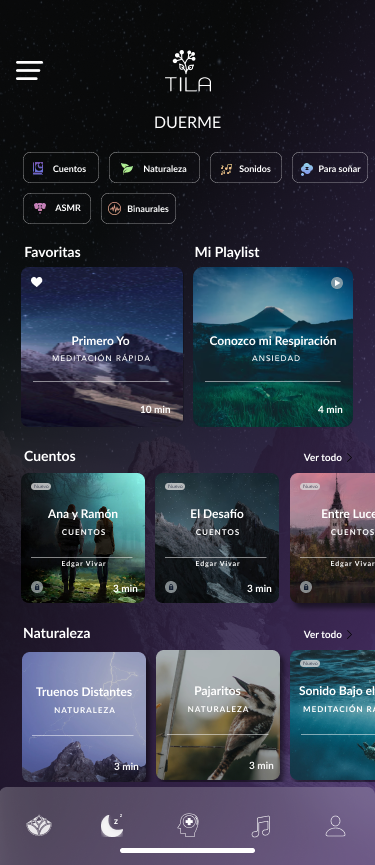 TILA · Duerme
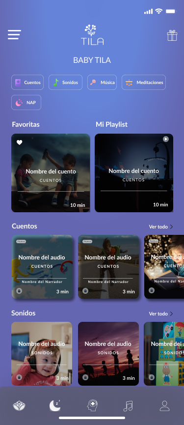 TILA Baby
05 · Audio Player
The audio player is TILA's most important surface — it's where the value is actually delivered, and where bad UX would break the meditative state the content is trying to create. The design uses full-bleed photography that fills the screen, removing all UI chrome except the essential controls: back-10, play/pause, forward-10, download, and share. Progress bar, title, category, and narrator are laid over the image with enough contrast to be legible in dark rooms.
TILA Baby's player uses the same system with warmer photography — baby and parent images — replacing the landscape nature photography used in the adult version, creating an immediate visual signal that the user is in a different mode.
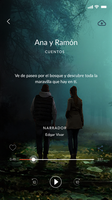 Player · Duerme (Ana y Ramón)
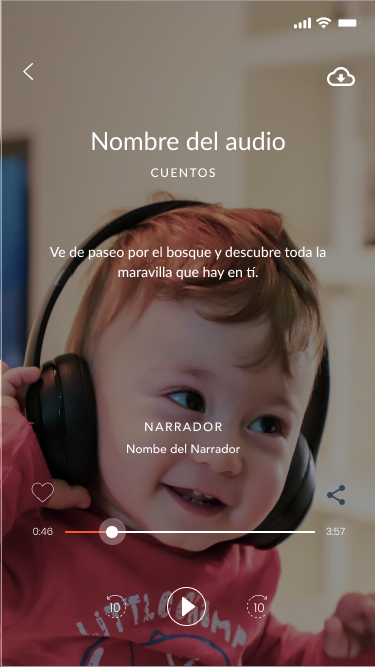 Player · Baby
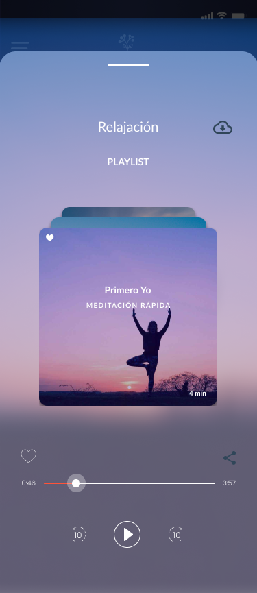 Player · Playlist (Relajación)
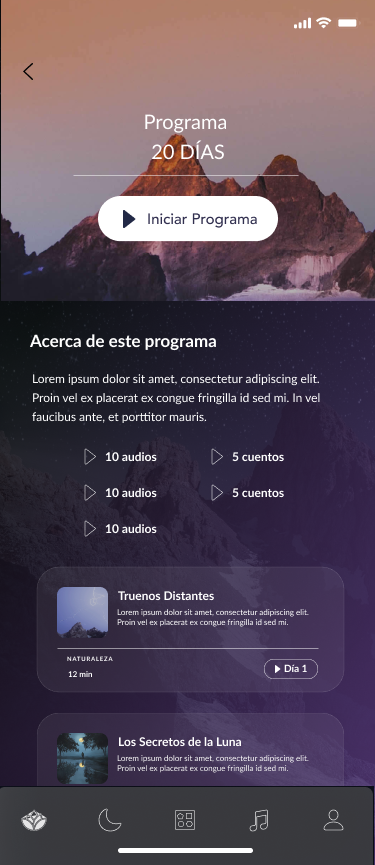 Programa · 20 días
06 · Respira — Breathing Exercises
Each breathing exercise in TILA has its own color identity — a visual signal of the exercise's emotional outcome that the user can recognize at a glance on the selection screen and feel during the session. The exercise screen uses a full-background gradient in the exercise's signature color, with an animated breathing circle as the only visual element needed: expanding for inhale, contracting for exhale, the count displayed inside.
The design deliberately removes the exercise instructions from the session screen — those are shown in an info overlay accessible via the ⓘ button before starting. Once you're in the session, the only thing on screen is what you need to do right now.
Selección de ejercicio
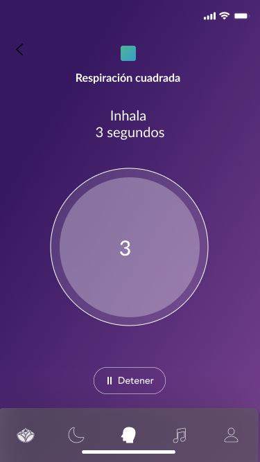 Respiración Cuadrada
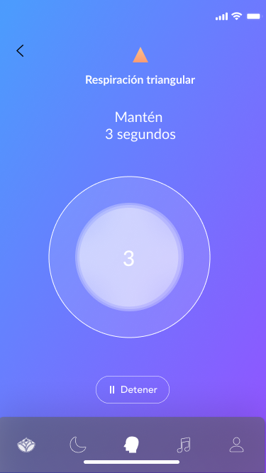 Respiración Triangular
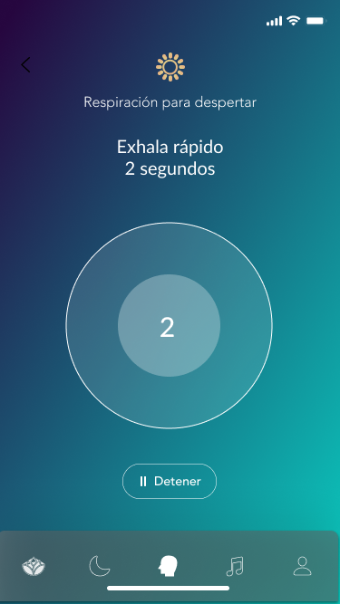 Respiración para Despertar
07 · Escríbele
"Escríbele" — "Write to it" — is TILA's most conceptually original feature. Users can write freely to named emotional states (their fear, their anxiety, their longing) in a private chat-like interface. The message never sends. The act of writing is the therapeutic exercise itself. The interface mimics a messaging app — familiar, low-friction — but with a key difference: the recipient is always an internal state, not a person. Emoji input is supported, because sometimes the right expression isn't words.
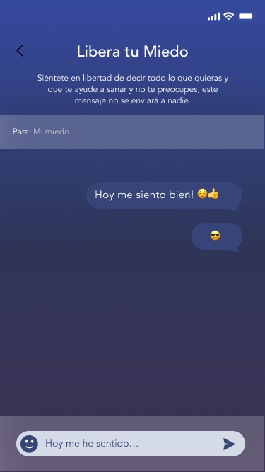 Escríbele · Conversación
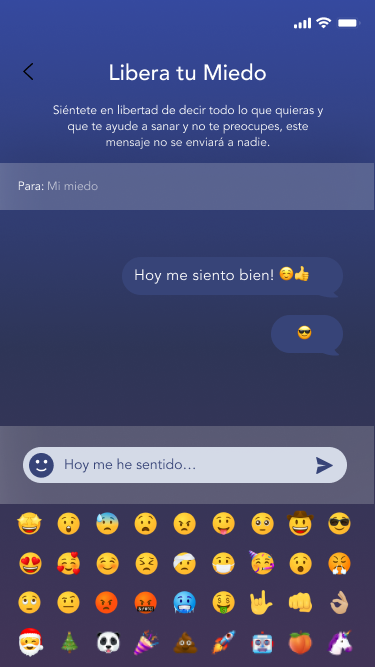 Escríbele · Input con emoji
08 · Huawei Watch
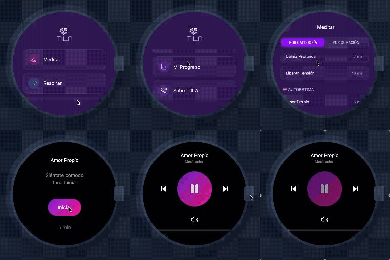
The Huawei Watch experience is TILA's most constrained design challenge: a circular display, no keyboard, no scrolling content catalog. The watch does two things: Meditar and Respirar — the two mindfulness actions that have genuine value without a screen and headphones. The interaction model is built around large, thumb-friendly tap targets that fill the entire watch face, with the TILA wordmark and logo as the only brand presence. The goal: open the watch app, tap your action, start. Two taps maximum from wrist to session.
A second watch face variant handles the audio player state — showing a waveform, the current audio name, and playback controls for sessions initiated from the phone.
TILA Watch · Menú
TILA Watch · Player
09 · Visual Design System
TILA's visual system is built around a deep purple base — dark enough to feel calming in nighttime use, with enough saturation to feel warm rather than cold. Contextual gradients shift the color temperature per mode: violet-purple for the main TILA experience, deep navy-purple for Duerme, lighter purple-blue for Respira. TILA Baby introduces a softer lavender-blue that signals a completely different mode without breaking the family relationship.
10 · Deliverables