
Branding · Executive Coaching · Mexico · Internacional
Branding · Executive Coaching · Mexico · Internacional
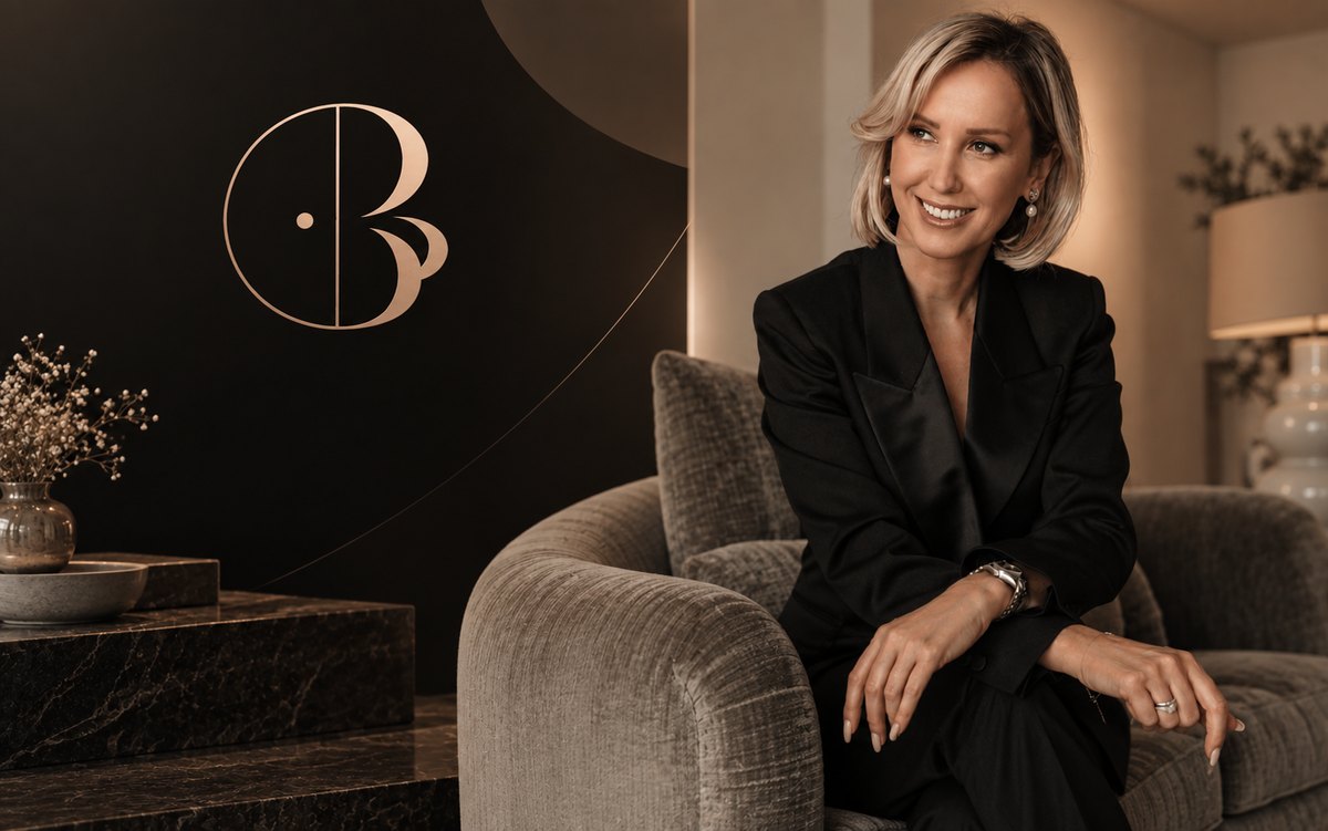
01 · Project
Dana Bezborodko is an executive coach specializing in high-demand leadership — working privately with CEOs, general directors, and senior leaders who need to recover clarity in how they decide, communicate, and hold pressure. Her practice is international, confidential, and deliberately positioned away from conventional motivational coaching.
The brief demanded a brand that matched that positioning exactly: no formulas, no noise, no generic visual codes. Something that reads — at first glance — as the level her clients operate at. Discreet luxury. Editorial. Authority without performance.
02 · Brand Foundations
Before any visual decision, the brand strategy established three anchors — the three words that every design, copy, and communication decision had to answer to:
Humana, directa, sin perder solidez ejecutiva.
Criterio y autoridad reconocibles desde el primer contacto.
Conversaciones reales. No fórmulas. No motivación superficial.
The positioning: lujo discreto, editorial y corporativo. The differentiation: no generic coaching, no motivational language, no formulas. Real conversations about real leadership.
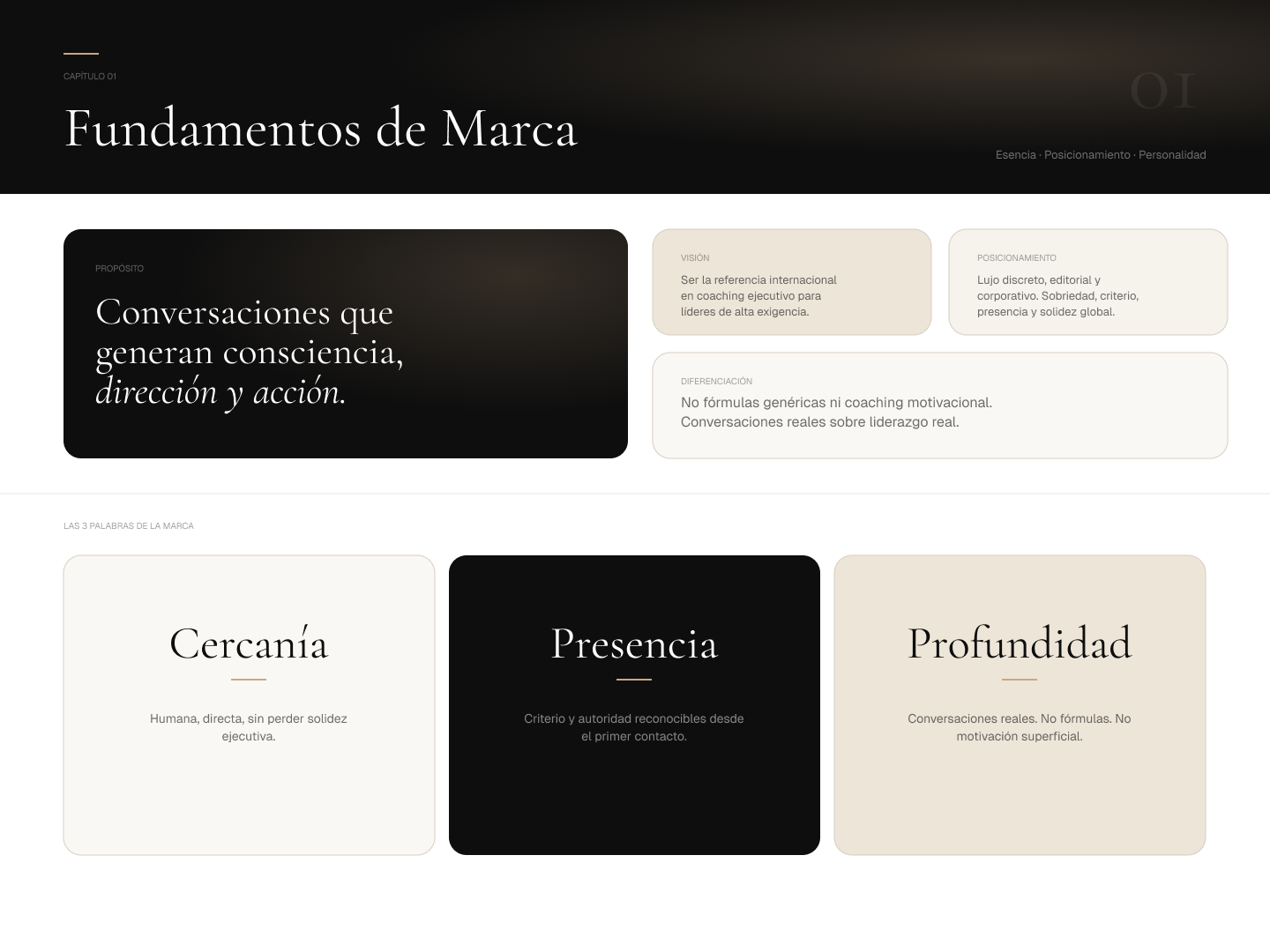
Brand foundations — propósito, visión, posicionamiento, diferenciación, and the 3 words of the brand
03 · Logo & Identity
The logomark integrates the initials D and B into a single fluid, geometric form — abstract enough to feel like a design or fashion mark, precise enough to communicate the rigor of executive practice. The vertical central line symbolizes focus, direction, and decision-making. The organic curves bring dynamism and proximity. The integrated point functions as a symbol of vision and clarity: the ability to identify what matters and generate impact from precision.
The complete logotype — full wordmark, "COACH EJECUTIVA" subtitle, and tagline "ESTRATEGIA. CLARIDAD. IMPACTO." — was designed to operate at the same visual frequency as high-end personal brands in architecture, fashion, and editorial design, not traditional consulting.
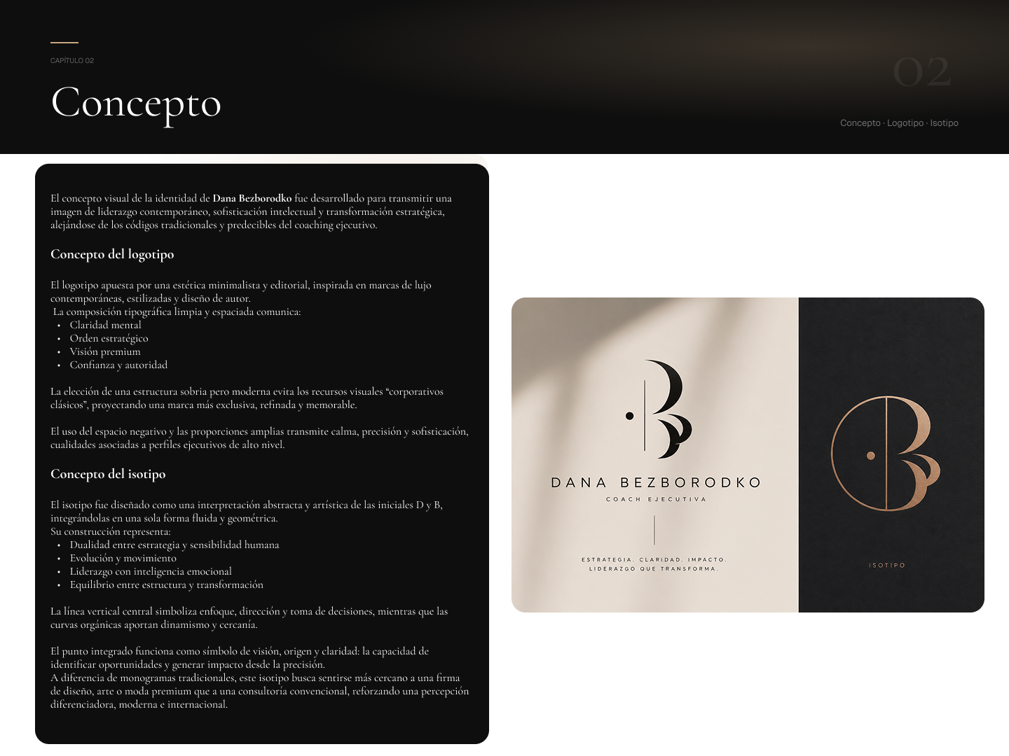
Logo concept and isotipo — DB monogram, full wordmark with "Coach Ejecutiva" and tagline, and standalone isotipo on dark
04 · Color System
The palette deliberately avoids the cold whites and grays of conventional executive branding. Instead, it's built on warm tones — blacks that feel grounded rather than corporate, creams and ivories that feel editorial rather than clinical, and a singular gold accent that is used sparingly as a signature element: lines, separators, details. The result communicates luxury without announcing it.
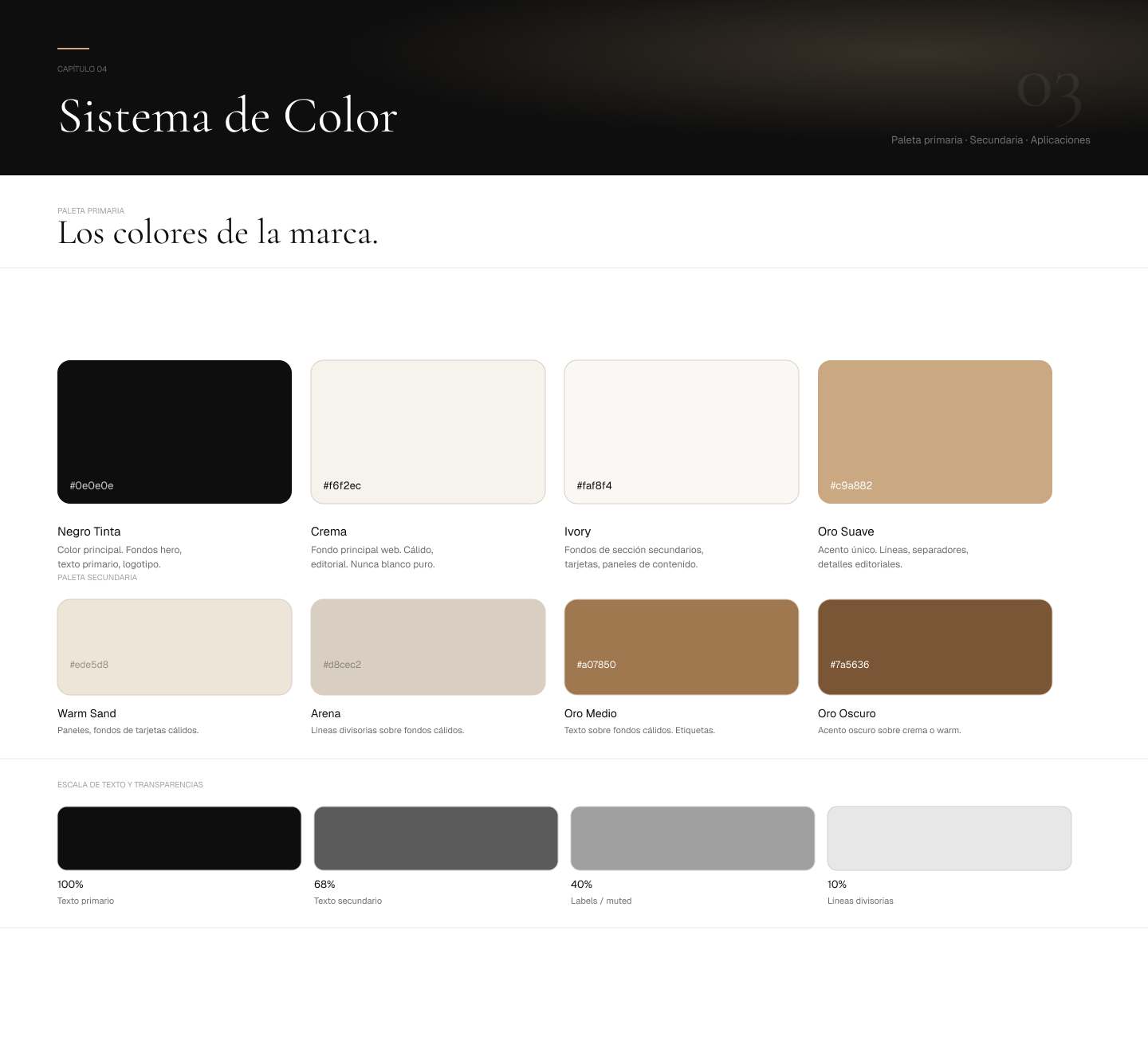
Color system — primary palette (Negro Tinta, Crema, Ivory, Oro Suave) and secondary palette with text transparency scale
05 · Typography
The type system pairs two purposefully contrasting voices. Cormorant Garamond (display/titles) — a high-contrast serif with literary authority, used in Weights 300–400 and italic. The kind of typeface that stops before it shouts. Geist (body/UI) — a contemporary geometric sans from Vercel, clean and precise at small sizes, never competing with the display type. Together they produce the exact tension Dana's brand needs: classical depth with current relevance.
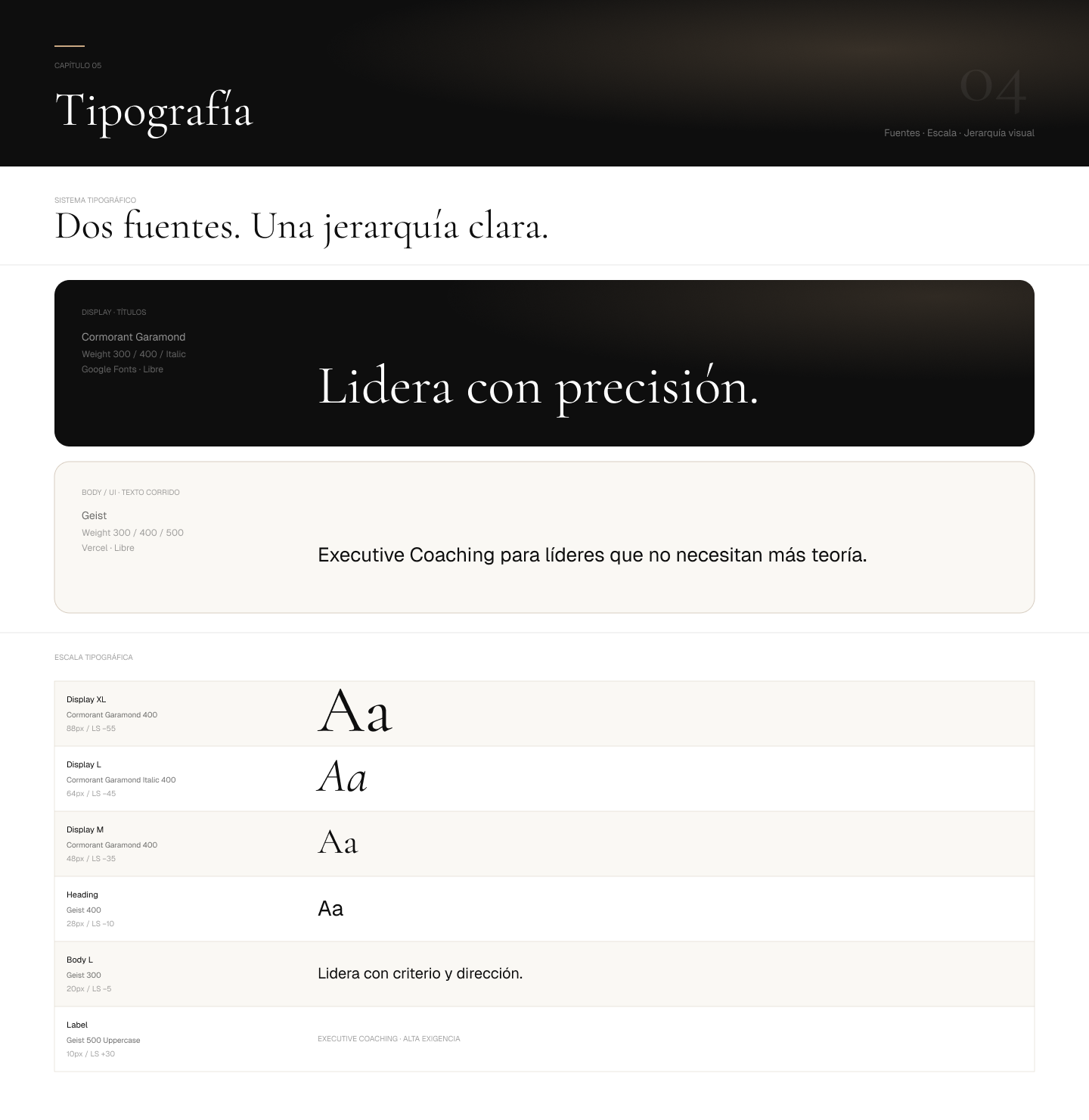
Typography system — Cormorant Garamond (display/titles, Weight 300–400 + Italic) and Geist (body/UI, Weight 300–500) with full typographic scale
06 · Voice & Tone
The brand voice guide establishes not only what Dana says, but what she doesn't. The key distinction: Dana's language is precise, direct, and executive — never motivational. Words like "liderazgo," "decisión," "criterio," "consciencia" are brand-owned. Generic coaching words like "transformar," "bienestar," "fluir," "mejor versión" are explicitly excluded.
The message transformation guide shows, pair by pair, how generic coaching language gets rewritten into Dana's voice — showing the delta between what every coach sounds like, and what Dana sounds like.
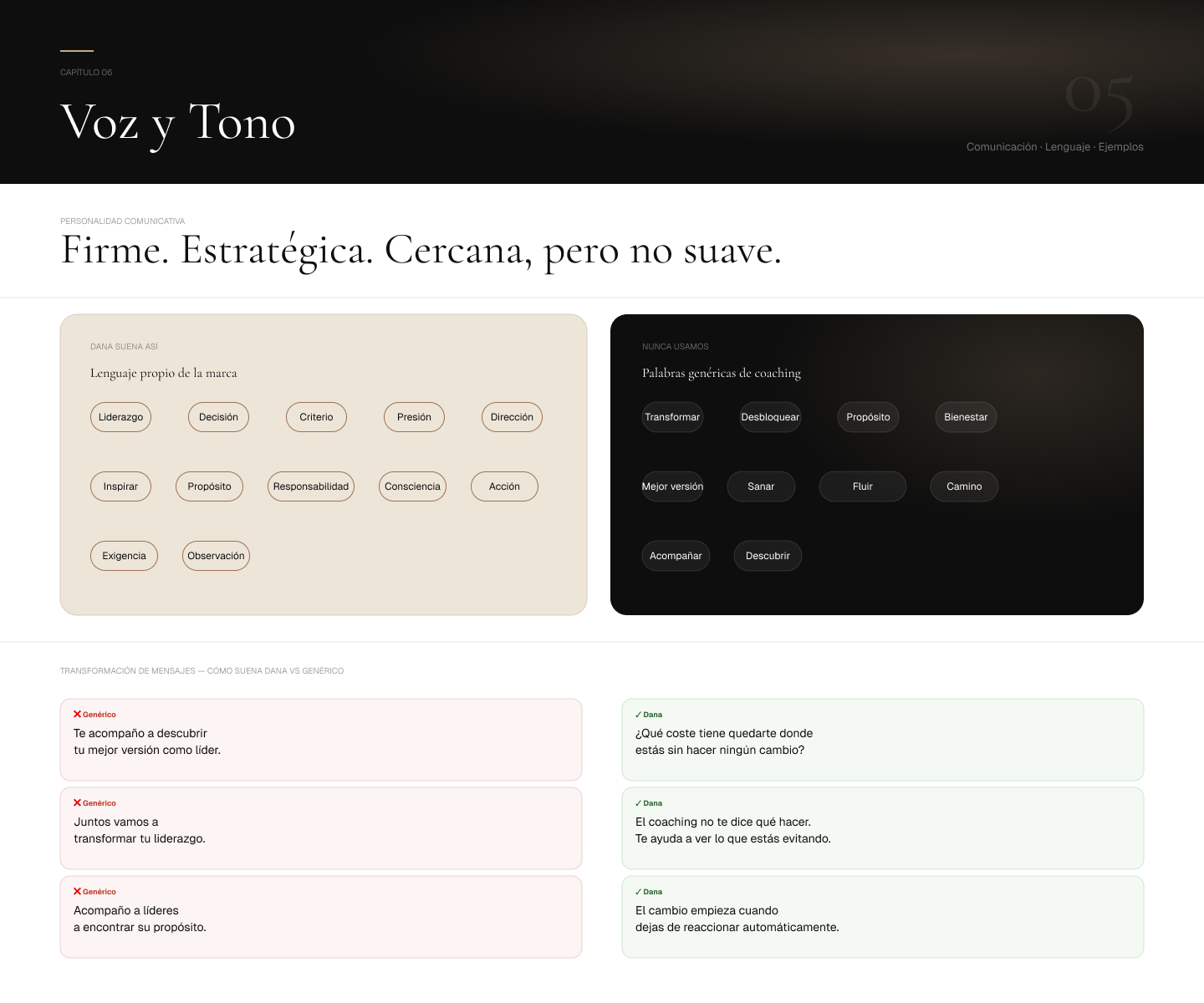
Voice & tone — language the brand owns, language it never uses, and side-by-side message transformation examples (genérico vs Dana)
07 · Website
The website is designed as a single-page experience — no product catalog, no pricing page, no funnel. A visitor arrives, reads, and either decides this is for them or it isn't. That clarity is intentional. The structure moves through: who Dana is and what makes her different, her trajectory and formation, the methodology (Escuchar. Confrontar. Mover.), the three service formats, the client profile that signals to the right leader that they've found their person, testimonials, Dana's philosophy, and a single contact invitation with no form — just an email address, because the process is personal from the first message.
The visual system on the site uses the warm cream and black palette with editorial white-space — photography as the primary design element, type as the second, and gold as the accent that appears only where it must.
Ver el sitio en vivo — psdigital.mx/dana
Website full scroll — hero, quién es Dana, trayectoria, metodología, servicios, perfil del cliente, testimonios, filosofía, y contacto — una sola página, una sola decisión
08 · Dossier de Presentación
The sales dossier is an 8-slide document designed for Dana to share privately with prospective clients — always as a PDF, always with total confidentiality. It covers who she is, the methodology, the three service formats, the client profile, what changes after working with Dana, the philosophy, and a clean contact invitation. The deck maintains the brand's black-and-cream palette with gold accents and Cormorant Garamond display type — so that reading the dossier is the same experience as reading the website or meeting Dana in person.
09 · Digital Strategy & Social Media
The digital strategy is built around a single principle: Dana's content should feel like Dana. No stock photography. No motivational quote templates. No generic coaching aesthetics. The content system covers Instagram (1080×1080 and 1080×1350 feed, 1080×1920 stories/reels), LinkedIn (1200×627 posts, 1080×1080 square), and TikTok (1080×1920) — each adapted to the platform's context while maintaining the brand's dark editorial tone.
The three content pillars: autoridad (Dana's perspective on leadership, direct and without softening), metodología (how the process works, what changes, and why), and reconocimiento (content the client profile sees and immediately thinks: "that's me"). Every post uses real photography, the DB monogram, Cormorant Garamond for main copy, and the gold accent for emphasis — never a decorative filter, always a signal.
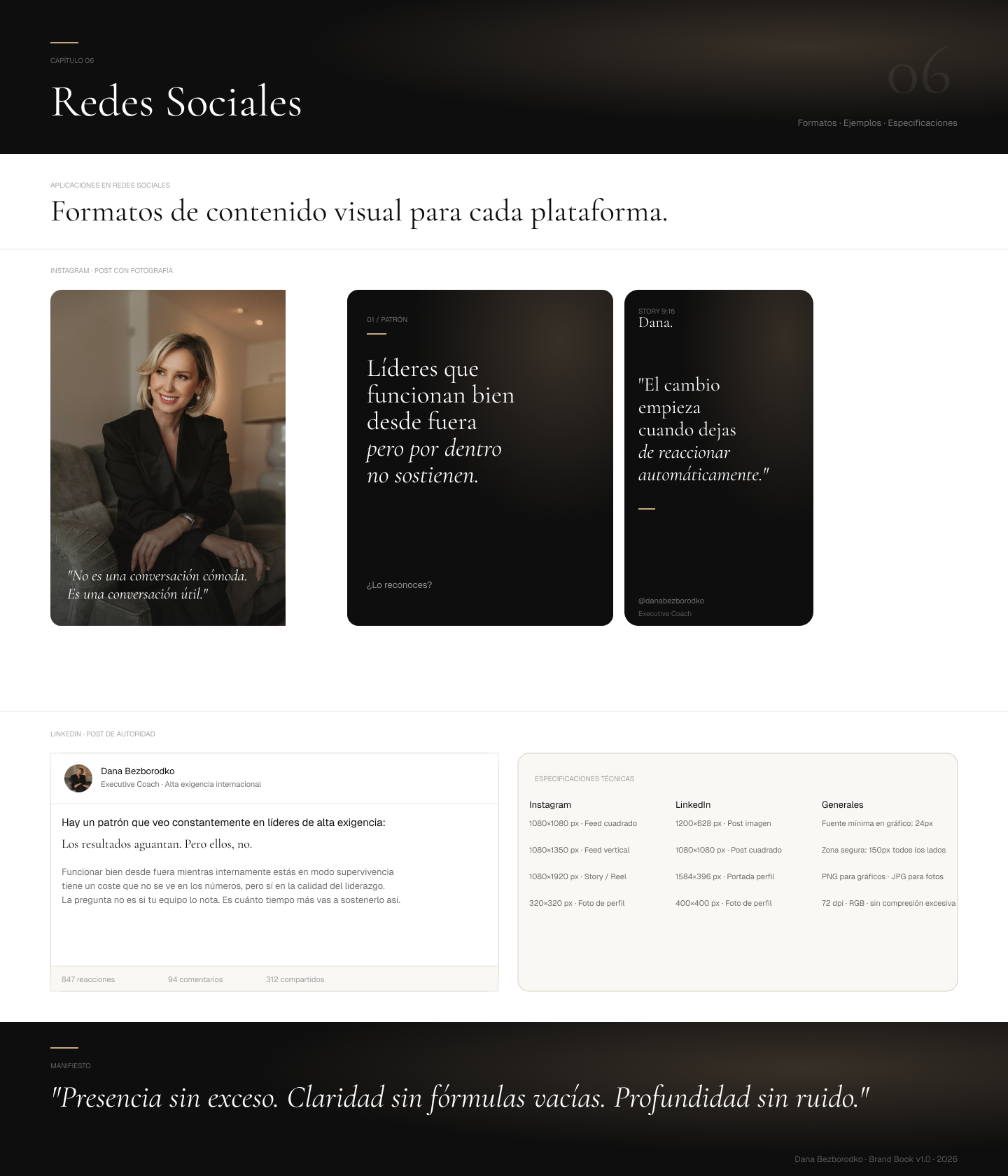
Social media formats — Instagram feed (photo post, pattern post, story), LinkedIn authority post, and technical specs for all platforms
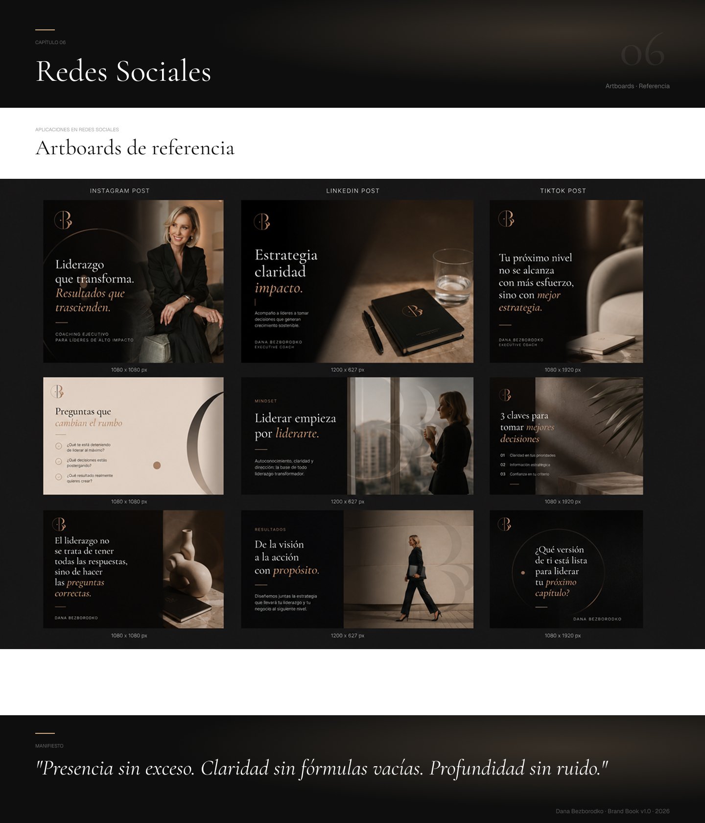
Social media artboards — Instagram posts (1080×1080), LinkedIn posts (1200×627), and TikTok verticals (1080×1920): leadership, mindset, methodology, and results content
10 · Deliverables