Data monetization · Surveys · Data Privacy · USA
Data monetization · Surveys · Data Privacy · USA
Outcome
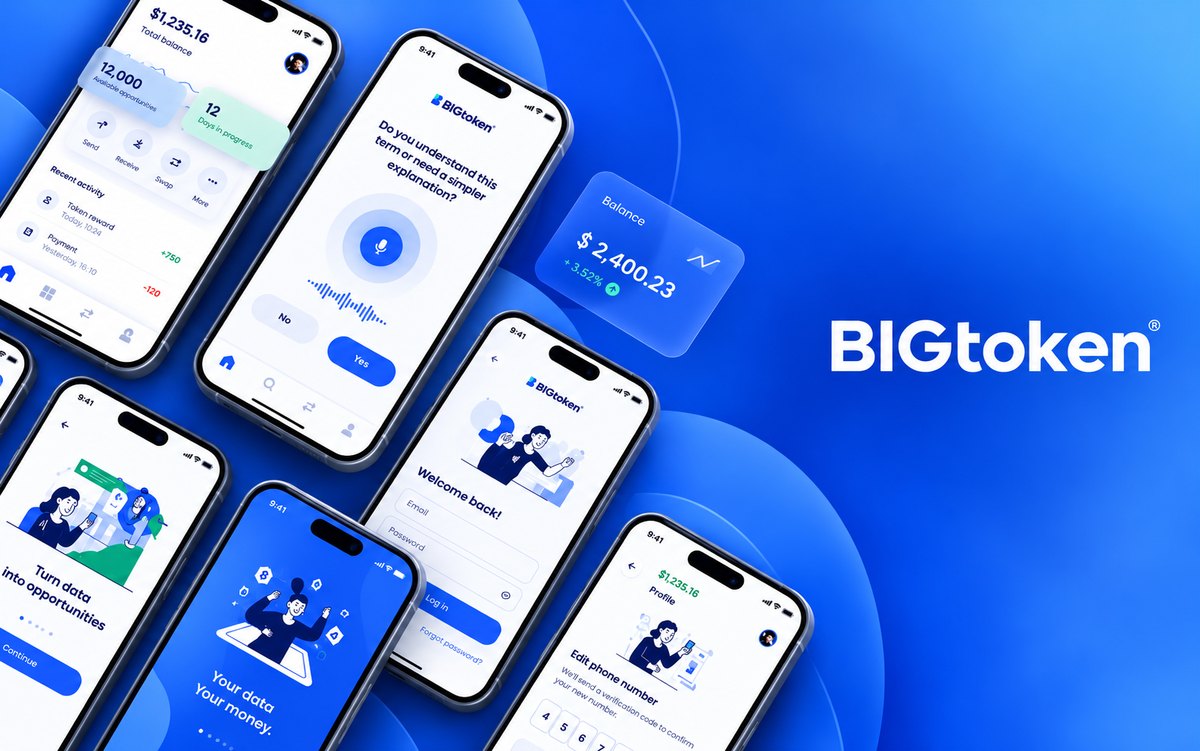
An app people didn't fully trust — where they doubted they could really earn, ran out of surveys, and had no say over their data — rebuilt from the evidence up. Every major decision traces back to a number from research.
The turning point wasn't the visual redesign — it was deciding what to build, and what not to, from what the data actually said. Including the call not to build a web version at all.
01 · Context
BigToken let people earn real cash by monetizing their own data — answering surveys, watching videos, uploading receipts. The business wanted to grow: expand from a lower-income audience to a lower-and-middle-income one, increase time spent in the app, and collect more valuable data. The experience was working against all three.
The product had a trust problem and a supply problem at once. Users doubted they could actually earn money — some online reviews even called it a scam. Nothing clearly explained what happened to their data. Sections were duplicated and confusing (“My earnings” and “My progress” led to the same place). And people simply ran out of surveys to answer, so sessions stayed short — under three minutes on average. An app that wanted more time and more data was giving people fewer reasons to stay. — feel unclear and untrustworthy. The redesign needed to rebuild confidence in the platform and make earning and redeeming feel intuitive and rewarding.
02 · Research
I ran a multi-method research process — a redesign this consequential couldn't run on opinion:
The survey was decisive. People wanted a dynamic, game-like experience over a bank-app feel, a colorful look, and — critically — 61% preferred mobile, with the web barely registering. The old desktop version had already been discontinued for being incomplete. That one number ended a debate: we would not build a web app.
03 · Before
The old app buried the one thing that mattered — the real-world value of what you'd earned — under raw point counts and a dated, dense interface. Duplicated sections, a confusing menu, and a wallet that made you do the math yourself all reinforced the same doubt: is this real, and is it worth my time?
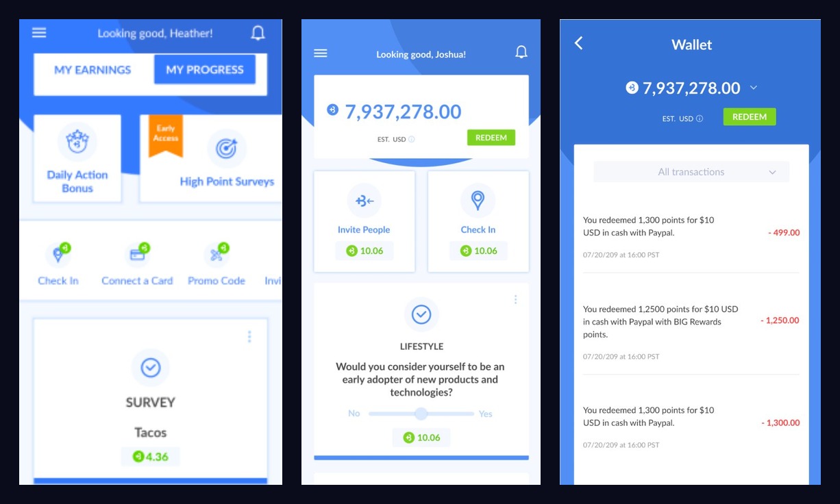
Original app — home with earnings tabs, point balance, and wallet transaction history
04 · Decisions
Every change below answers something the research surfaced:
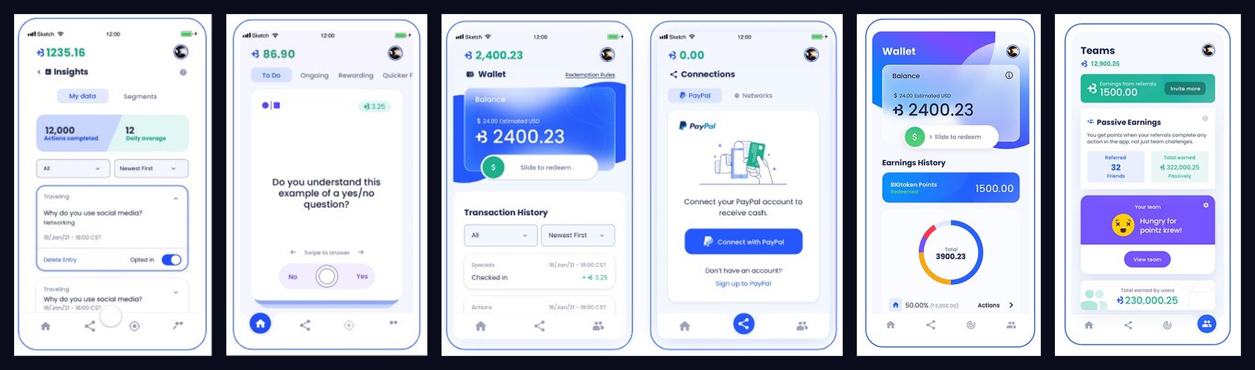
Redesigned app — survey interaction, wallet with slide-to-redeem, PayPal connection, teams dashboard, and insights view
05 · Motion & Animations
A key part of the redesign was adding purposeful motion — animations that make earning feel satisfying, transitions that communicate state changes, and microinteractions that give the app a premium, polished feel. Every animation was designed with a specific intent: reinforce the action taken, provide feedback, and make the product feel alive.
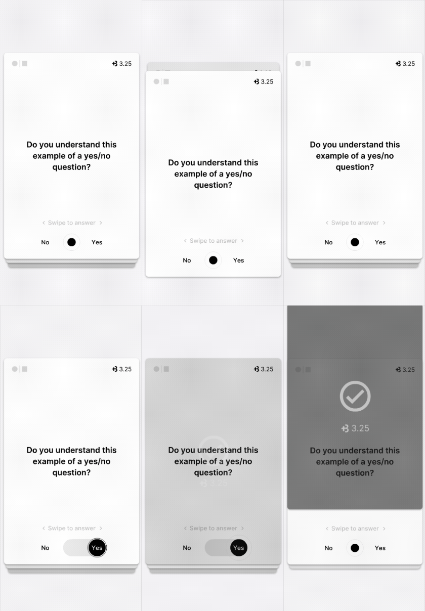
Survey swipe-to-answer microinteraction
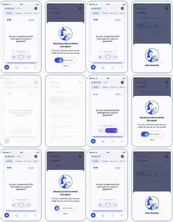
Earnings update and screen transitions
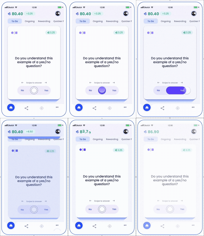
Insights data reveal and toggle interactions
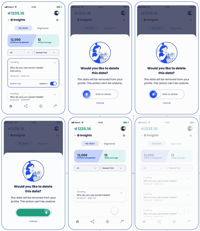
Delete data confirmation flow with motion
06 · Lessons
I owned this end to end — research, competitive analysis, the survey, information architecture, UI, and motion. Three things stuck with me:
A single number can end a debate. The 61% mobile preference settled the web-vs-mobile question faster and more decisively than any argument could. Research isn't a phase you clear — it's how you avoid building the wrong thing. The 61% mobile preference settled the web-vs-mobile question faster and more decisively than any argument could. Research isn't a phase you clear — it's how you avoid building the wrong thing.
Design for the user you have and the one you want. Modeling both the current lower-income user and the middle-income buyer kept the redesign from optimizing for one at the other's expense — exactly what moving a product upmarket demands. Modeling both the current lower-income user and the middle-income buyer kept the redesign from optimizing for one at the other's expense — exactly what moving a product upmarket demands.
Trust is a feature you can design. The biggest lever wasn't a prettier screen — it was making value and data-control visible. When the doubt is “is this real?”, clarity beats polish. The biggest lever wasn't a prettier screen — it was making value and data-control visible. When the doubt is “is this real?”, clarity beats polish.